Flora: Final revisions

The original designs that I posted for feedback looked like this:

As well as this I continued to experiment with some other designs and came up with this:

business card n wrap

I have to say that, without a doubt, this is my absolute favourite design.  I think it’s sophisticated, beautiful, stunning and meets the brief requirements to a tee.  To be honest, I thought that, when I posted this for feedback, it would be hands-down the absolute winner.

I was wrong.

The majority of people are still favouring the pink design, with no border:

business card n wrap pink

All I need to do now is finalise the business card in terms of layout and colours for the font. 🙂


Flora: Business cards

In my last post I compiled three digital designs for wrapping paper, which I posted online for feedback. The feedback I received led me to rework two of my designs:

Design 1 – I reworked the original design (pictured left) by changing the background to a lighter option, and giving a little more space between the elements. I also added an inner pink line to separate the inner pattern from the border.

Design 2 – I removed the stroke lines from the design and gave slightly more space between the elements which has resulted in a lighter design overall.

I used these designs in my business cards to create cohesion between business card and wrapping paper.  My business cards turned out like this:

business cards together

business cards together 2

My personal favourites are design 2.2v1 (or v2, but I think I slightly prefer the green over the pink). My second choice is design 3v2. It will be interesting to see what the others think.

Flora: Wrapping Paper

The last week or so I have been working on my wrapping paper designs for the Flora assessment. Having previously posted thumbnails for the ideas that I had, I took the three favourites, numbers 6, 7 & 8 (pictured below) and developed them into digital designs using Illustrator.

The first one that I worked on, based on thumbnail 7, utilised my pink and reds colours scheme.

I “placed” a screen shot of my thumbnail onto an artboard in Illustrator and used the pen tool to draw round the outlines. My latest Illustrator revelation is that I’ve realised it’s better to complete paths, rather than leave them as open lines.  This means that things like “Fill” then work as expected, as does the tool builder tool- you don’t even have to start with circles or rectangles etc as I previously thought.

This pattern (above) used a basic building block as shown below:

It was actually quite difficult to get it to tessellate though because I wanted it to have a rotation in it too and for the design to be staggered. To actually create the pattern I fiddled around with the tranform> move option to work out exactly what x and y transformation I needed, then I just repeatedly applied this until the page was filled. While this worked I didn’t really like it as an option for creating a pattern – mainly because it means that any amendments I make I will have to fill the page again piece by piece, or amend every single copy separately.

The finished design was like this:

The second design I looked at, thumbnail 8, utilised my green colour scheme:

Looking at some of the designs that William Morris has done, I noticed that he often uses a colour background, which also features in finer details in the foreground.  I decided to create a design that used green as the background colour, in the same way that Morris used blue in the design shown below:

Retrieved from https://www.tinsmiths.co.uk/william-morris-linen-print-bramble-indigo-and-mineral.html

I put together the following again by using a snipping tool to place my pencil drawn thumbnail into an Illustrator art-board and to draw around the shapes using the pen tool. This time I was careful to consider the repeat within a 200 x 200mm square so that I could use the make>pattern option when I was ready.

I then coloured my design using the fill and stroke buttons within Illustrator.  Another handy tip that I have discovered recently is to do with the swatches panel.  By looking on the drop down menu (top right hand side of the swatches panel) you can choose “select all unused” and delete all the colours from the swatches panel.

You then just need to add in the colour theme you have chosen, which I had stored in my cc library.  You do this by opening libraries and right clicking on the chosen colour theme to open the fly out menu, which has the option “add to swatches”.

This has the advantage of not having to scroll through unused colours or risk accidentally choosing the wrong colours.  It’s a lot cleaner and worth the minute that it takes to sort out your colour palette.

Once coloured in I was able to use the “make pattern” option to create this pattern, which is altogether a lot simpler. I also decided to explore the idea (previously mentioned by my course trainer) of adding in a  border which was easily done. My final design ended up looking like this:

I think that this design is my personal favourite:  I was really pleased how it turned out.  The only thing I would really like to change potentially is to make the design flow into the border more seamlessly.  I would also like to rework this design using the other colour scheme.  This should be quite easy to do using an edit> edit colour> rework artwork option.

My final design was based on thumbnail 6.  It’s my least favourite of my thumbnails, and even worked in colour I’m not a big fan. However, I did try adding some extra colour detail by using a brush tool in photoshop once I had done the basic colouring using Illustrator.

Having completed my wrapping paper designs I have posted all three onto the course Facebook page, the uni online forum and also emailed out to my study buddy to get some feedback on which design works best.

In any case the next phase is to put together 3 digital versions of a business card.

SaveSaveSaveSave

SaveSave

Flora: Thumbnails

Today I managed to complete the task of putting together 8 thumbnails for both wrapping paper and business cards and am reasonably pleased with both. I feel like I am starting to forge out a direction with the project now and am excited about the next phase which will be to digitally render 3 designs for each.

The business card thumbnails look like this:


And here are my wrapping paper thumbnails:

I have posted both sets of thumbnails in the usual places to gain feedback and am now just waiting to see what the verdicts are. In the meantime, I will start digitally creating the logotype as this will be required no matter what design wins out.

Flora: More Research

I posted my designs for feedback and have decided to go for the following option:

I think that it offers enough interest to be able to make it “artistic” whilst still satisfying the “elegant and sophisticated” requirements.  (“Quality” and “bright and bold” will come later!).

My trainer has suggested that I look at William Morris, Art Nouveau, and Alphonse Muncha for some ideas relating to patterns and colour palettes.  Remember that my current colour palettes are as follows, so it will be interesting to see if they change following this research.

William Morris:

William Morris was a British textiles designer, poet, translator, and writer among other things, born in the 1800s.  He was associated with the Arts & Crafts movement, which evolved from an attempt to reform design and decoration in the mid 1800s,  and is noted for his wallpaper design. His early work was influenced by medieval tapestry’s while later works show very dense designs in which foreground and background were closely integrated.  He is also very clearly influenced by nature, plants and foliage.

Retrieved from http://william-morris.com/wallpapers/2/

I especially like the way in which Morris’s designs developed in later years:  The way that he fills the space with his designs, the fact that the shapes are rotated and translated, the detail that he adds to the foliage and petals.

Retrieved from https://www.tinsmiths.co.uk/william-morris-linen-print-bramble-indigo-and-mineral.html
Retrieved from google image search

The following image shows that Morris was not afraid to use bold colours in his designs too.  I think these colours look quite modern considering that he was 19th century.

Retrieved from https://au.pinterest.com/pin/495466396477472775/?lp=true

Alphonse Muncha:

Alphonse Muncha was a Czech Art Nouveau artist, born 1860, who became famous for his commercial posters and distinctive style.  He work often featured women in neo-classical style surrounded by flowers and other decorative, nature inspired shapes and forms.

Muncha’s work particularly resonates with me for many reasons:  The distinctive outlined forms, the era of the clothing, the attention to detail with things like the patterns on the fabric of the clothes, the jewellery they are wearing, and the colour palette.

Retrieved from google image search


SaveSaveSaveSave

SaveSave

SaveSave

Thumbnails: Flora

I’ve got to say it: Thumbnail formation has been tricky.  I’ve had to do a lot of coaxing to get any kind of inspiration going.  My journey to thumbnail completion heaven was as follows:  Given my total lack of ideas to begin with, I started with what any self respecting wannabe graphic designer would do, and compiled a list of words associated with “florist”. The best I came up with was “orchid” and “butterflies” which then got me thinking about “elegant” flowers. Weirdly enough, by chance, I happened upon some “lilies of death” whilst out walking my dogs that afternoon.

Despite the name, which is quite off-putting by any standards, they struck me as pretty elegant so I took a few pictures and used this as additional inspiration.

Personally impressed by the amount of inspiration a couple of photos of a death lily had bought, I decided to buy myself a bunch of flowers as further creative stimulation. Inspiration phase definitely has an upside, beyond merely being enjoyable. I also visited three florists in the local area to get a feel for things.

IMG_4786

This definitely helped.  I think I have ended up filling in excess of 20 pages in my sketch pad, albeit mostly just repeating the same images over and over again.  I’m still impressed with myself.

I really like the iris and would love to get this into my design, although it’s a little on the complicated side.  Still, I think that it really ticks the boxes for the five buzz words that went with this brief of “elegance”, “artistic”, “bright & bold”, “sophisticated”, and “quality”.

Having now compiled a list of options for the logotype I’ve now realised that I actually need to compile eight thumbnails for a business card and eight for wrapping paper, but without actually deciding on a logotype this is proving quite difficult. I think my step has to be to show people the logotype options so that I can choose the best to work with for my business card and wrapping paper design.

Project: Flora Business Card and Wrapping Paper (part 2)

Following on from my mood board I have been experimenting with colours for my business card and wrapping paper.  Given that the brief stated “bright and bold”, that’s exactly what I have been experimenting with, using the brightest of flowers as my inspiration.

Screen Shot 2017-09-02 at 9.28.54 pm

(Ignore the bottom right theme in the picture above which related to a separate project.  Also, I wanted to add that “cinnamon mint” is a colour palette that I found on Adobe Colour when I explored existing themes. It’s a beautiful selection of colours – I can see why it’s in the top downloads).

In creating my themes, you can see that I have been strongly influenced by bright coloured flowers such as gerbera, lavender, iris,  chrysanthemums, sweet William, roses etc, but also by the foliage and leaves.

I wanted to offer two colour schemes that were reasonably different from one another,  so I think I will choose “flora 15” which will actually be gold, orange, deep magenta, and pink (the bloom inspired option). The other choice will be “flora 12” which offers 3 shades of green (green-blue, fern green and a moss green) and fuchsia pink (the foliage inspired option).

Screen Shot 2017-09-02 at 9.43.17 pmScreen Shot 2017-09-02 at 9.43.23 pm

Next stage is to produce the thumbnails.  To further my research and help generate extra inspiration I think that, tomorrow, I will buy myself a bunch of flowers.  (Any excuse!).

🙂

Project: Florist Business Card and Wrapping Paper

I’ve just started a new assignment for my graphic design course that asks me to design a business card and wrapping paper for a fictitious high-end florist in CBD Melbourne. The florist runs by the name of Flora and is in the process of rebranding their business. As well as providing flowers for the home, they also supply event, restaurants, weddings, merchandising and corporates. Their website states that they “approach floral arrangement as art” and they are looking for a new logotype with small visual component that is simple, elegant, sculptural, bright and bold.  They also want the design to reflect their high level of customer care and attention to detail.

Now I should actually be dancing with joy over this assignment given that it’s right up my street: Not a single footie logo in sight, I love designing patterns, and I’ve already done quite a bit of research into florists & business cards with other projects that I’ve tackled, yet my mind is a total blank.  So the only thing I can do is to follow my training and start by researching florists.  I have to produce a mood board with at least 10 images on it, so I think I’ll start with a google image search and collect what I find on a Pinterest board.

A week later…

Finally managed to put together my mood board:

I think the image that I find most inspirational out of all my chosen pictures, is the gold pattern at the bottom left, although I think all the images have a lot to offer.

What I need to remember are the defining words for this project of “elegance, artistic, sophisticated, quality, bright and bold”.  Oddly enough, I find the words “bright and bold” almost contrary to what the rest of the words could conjure up – e.g. elegance and sophistication could quite easily be designed using white, cream, pale pastels or paper embossing techniques (ie. no colour at all other than the paper colour). Bright and bold throws another element in entirely.

Next step is to work on some colour palettes:  2 options of 4 colours each.

SaveSaveSaveSave

SaveSave

SaveSave

SaveSave

Neo-Expressionism explored

Neo-Expressionism was a late-modernist, early post-modern art movement that emerged in the late 1970s as a reaction to the overt simplicity and stylisation of Conceptual & Minimalist art works. Its origin is attributed in the main to George Baselitz, a German artist who led a revival of German art in the 1970s in an attempt to revive the damaged German national identity following WWII3.

Adieu 1982 by Georg Baselitz born 1938

Neo-expressionism was characteristed by large scale works that were extremely expressive, usually featuring vivid colours and tangible textures.  The focus was on emotional expression, or arousing an emotional response:  Brush stokes were visible, paint thickly applied, colours did not necessarily reflect the true state of the object; and the subject matter was often shocking in some sense: aggressive, erotic or addressing the darker side of human nature.  Baselitz’s “Die Grosse Nacht im Eimer” (“The Big Night Down The Drain”) for instance, provoked outrage when it was unveiled at Baselitz’s first solo exhibtion; the work being declared as “obscene”.7

Neo-expressionists embraced historical and mythical imagery.  Their work offered a refreshing change from the emotional detachment of Minimalism, a fact that was initially respected by critics.  However,  critics of the movement soon rejected the works as “regressive” and “traditional”, with a negative connotation”5. There was, also, an anti-feminist undertone that was not well received in an era in which the so-called second wave of feminism was occurring. Indeed, women were notably absent from key exhibitions that occurred during this time, including the acclaimed works of Elizabeth Murray and Maria Lassnig. This, coupled with the fact that works of this ilk were linked to a sudden boom in the commercial art market in the 1980s, meant that the authenticity of the art was inevitably brought under scrutiny.

173260

‘What came through in the work was a self awareness of the attempt to make a splash rather than an authentic investigation into cultural or psychological states.  It was almost as if they were mocking expressionism by seeing how far they could push ugliness and bad painting”.6  Aimee Zvinakis, 2016.

Neo-expressionism, it seems, was viewed as a superficial entity, one that had no substance, no real message to convey.  Yet, on reviewing the work of the time, I am forced to ask “Why?”.  No doubt there were multitudes of artists seeking to ride the commercial wave at the time, but surely that would be the case with every art movement, genre, or style that occurred in the moment?  Yet there is clear evidence that a number of  key artists, from Francesco Clemente, and Julian Schnabel to Enzo Cuccin and Sandro Chai, produced some notable and beautiful work that was both thought provoking and considered.  The work of Jean-Michel Basquiat, for instance, whose work epitomises the style, exemplifies the point:

“He had a special talent to take all the street energies and translate them into high art”, Robert Farris Thompson.

cuadro-basquiat-reproduccion-digital-en-tela-canvas-D_NQ_NP_725211-MLA20505083434_122015-F

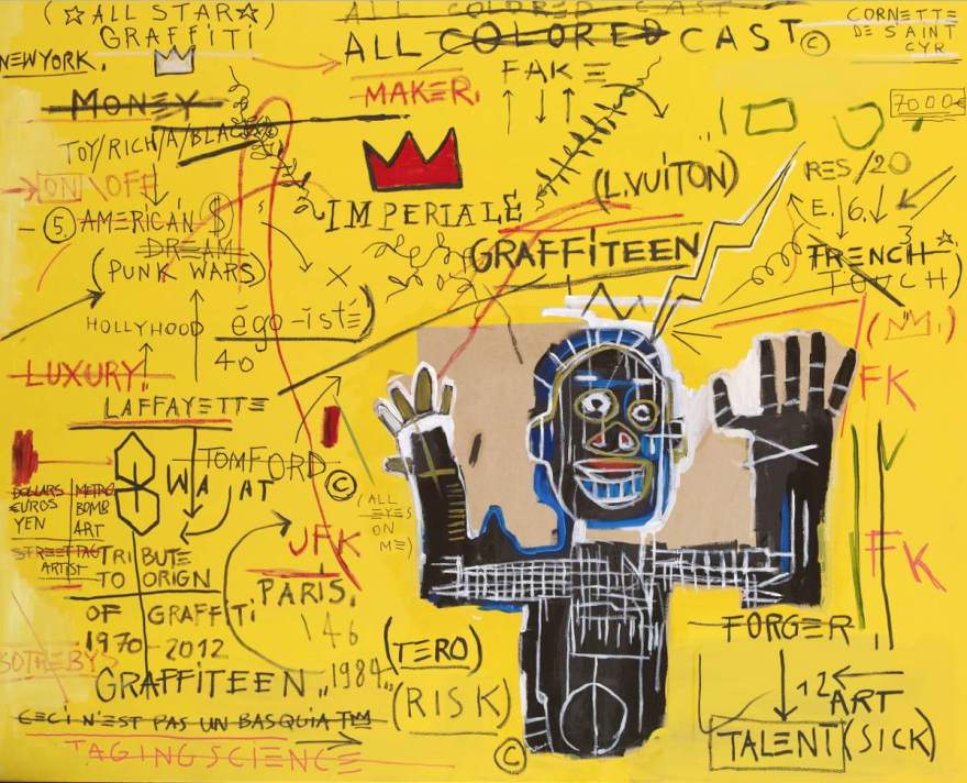
However, even during an interview in the documentary “Jean-Michel Basquiat – The Radiant Child”13 Basquiat, himself, was not able to articulate the messages behind his own work, perhaps giving credence to the assertation that Neo-Expressionism was a meaningless manifestation of commercialisation. Yet, perhaps, the critics were too quick to judge: The images that Basquiat painted clearly did have a message behind them since the majority reflected the story of the life and experiences that he, as a young black artist in New York, had experienced.  Much of his work carried a political message too. “Natives carrying some guns, bible, amorities on safari” was clearly a reaction in part to the growing disquiet Basquiat had about how black people were often treated differently to their white counterparts.

8fbeeba281eba55e8672ca76eeb2503d

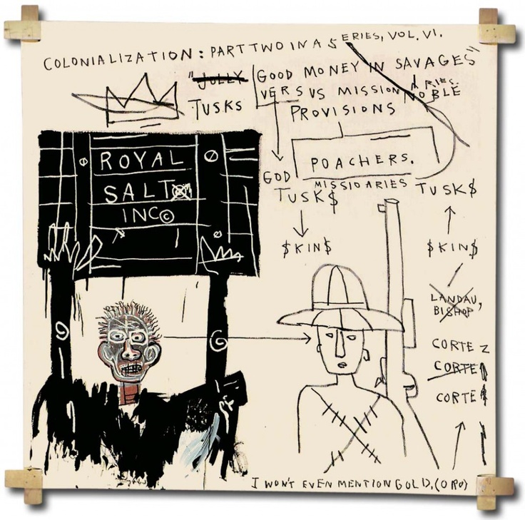
In particular, this can be seen in his reaction to the negative, often racist, reviews he started to receive about his work. “…If I was white, they’d just say “artists in residence” “ he stated, when asked to comment on reports that he was locked into the basement to work.

“They’re all mercenaries… trying to make as much money as they can, as fast as they can”, Basquiat, 1986.

Despite Basquiat’s clear talent, he, for one, was never properly recognised by many as anything more than a graffiti artist:  Indeed, the Oxford Dictionary of Art & Artists labels him a “street artist” whose work is “merely novel”.

The influences of Neo-Expressionism can still be readily evidenced today across many medias.

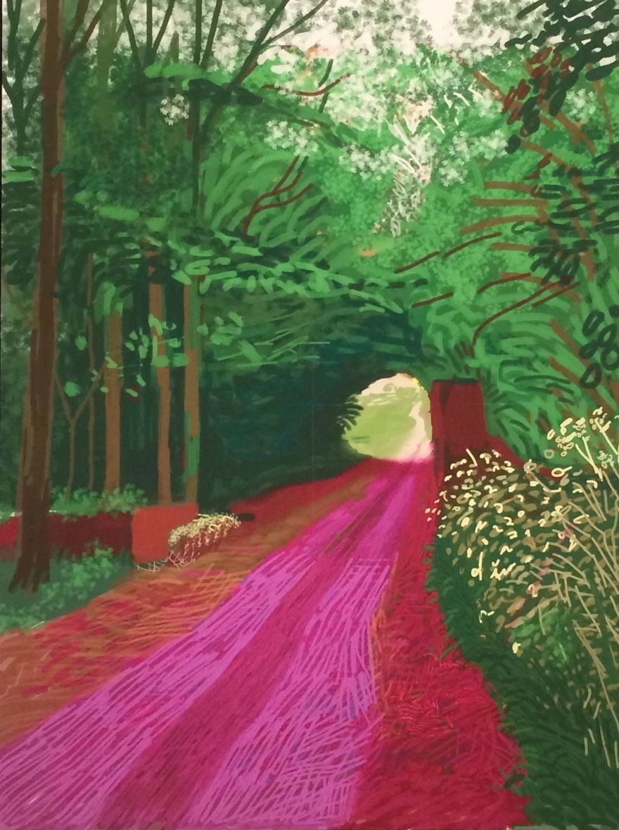
David Hockney’s “Current” exhibition at NGV, Melbourne, is clearly influenced by Neo-expressionism:  Much of Hockney’s work is created in large proportions, textured brush strokes are obvious, and colours are loud and deliberately garish.  There is also a distinctive rudimentary execution apparent across much of Hockney’s work, a manifestation of the digital medium he has pioneered in his work,  but which is readily comparable with work from the Neo-Expressionist era.

img_3330-e1489360308616.jpg


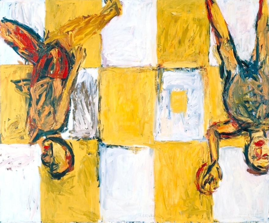
Lesser known artists also draw influence from this era.  Matthew Clarke, for instance, is a local Victorian artist who is currently exhibiting his “Wallabies Republic” work in the Mornington Peninsula Regional Gallery.  His linocuts of wallabies, which he uses as an outlet to express his own emotions, reflect the work of Basquiat’s later large scale canvas’.

matthew-clarke-w.jpg

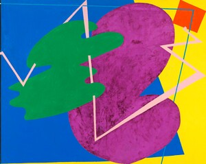
Further modern day evidence can be found on CD covers such as, For Minor – the Rising Tied and “The Roots, Game Theory”, the latter of which depicts the image of a stick figure hangman, drawn in typical Neo-Expressionistic crudeness. The XTC Drums & Wires CD cover, is reminiscent of Elizabeth Murray’s “Children Meeting”, featuring a limited number of organic shapes in large blocks of vivid, flat colour.

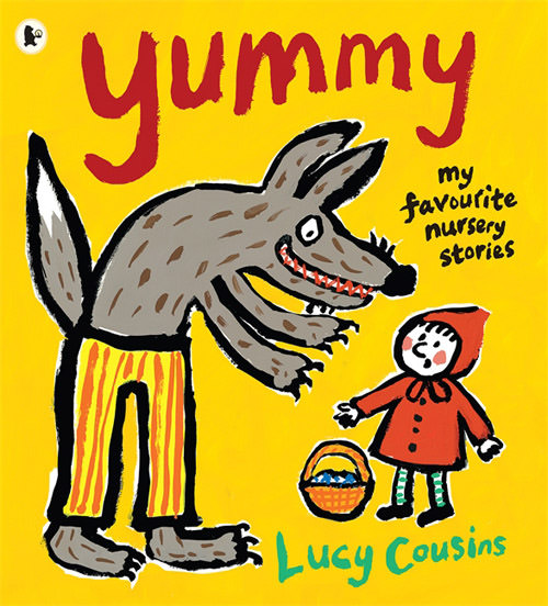
Book covers such as Ferne Cotton’s “Happy” utilises the idea that colours, texture and, to some extent, freedom of expression with the paint brush, can be used to reflect emotion. Even children’s books, like “Yummy” by Lucy Cousins, featuring a simple, child-like drawing of a wolf, can be likened to Neo-Expressionism in a more modern form.

yummy-lucy-cousin

Whatever the view of Neo-Expressionism, and whether or not the critics like it, its influence and contribution to art is a tangible entity and a source of inspiration.

Bibiography:

1Author & Date unknown. “Neo-expressionism”.  [online]. Available at https://en.wikipedia.org/wiki/Neo-expressionism

2Wolf, J (2017). “Neo-Expressionism Movement Overview and Analysis”. [Online]. Available at http://www.theartstory.org/movement-neo-expressionism.htm

3 The Art Story Contributors, (2017). “Georg Baselitz Artist Overview and Analysis”. [Internet]. 2017. http://www.theartstory.org/artist-baselitz-georg.htm

4Kordic, A (date unknown).  “10  Masterpieces of late neo-expressionism art movement”. [Online]. Available at http://www.widewalls.ch/neo-expressionism-art-movement/

5 Natalie P and Nadia Herzog, (date unknown). “Was Neo-Expressionism just a trend of the Art World”. [Online]. Available at http://www.widewalls.ch/neo-expressionism-art-movement/

6 Zvinakis, Aimee, & Revermann, Brian (2016). “The Eclectic Eighties part 1 – Neo-Expressionism”. Youtube clip viewed 10 March 2017. < https://www.youtube.com/watch?v=BSJi1FRnhfQ&gt;.

7 Rosenthal, N (2007). “Upside Down World”. [Online]. Available at https://www.theguardian.com/books/2007/sep/22/art.art

8 Baselitz, G. (1963). “Die große Nacht im Eimer”. [Fomat]. Available at https://en.wikipedia.org/wiki/Die_große_Nacht_im_Eimer

“Oxford Dictionary of Art & Artists”

9 Hockney, D (Date Unknown). Paintings from Current exhibition photographed by Boxall, C.

10 Murray, E (1978), “Children Meeting”. [Format]. Available from http://collection.whitney.org/object/2896

11 Cousins, L (2009) “Yummy: Eight Favourite Fairy Tales”. [Format]. Available from https://www.amazon.com/Yummy-Eight-Favorite-Fairy-Tales/dp/0763644749

12 Allen, D (1984). “The rude painting, or Michael and Me”. [Format]. Available from http://www.aasd.com.au/index.cfm/list-all-works/?concat=allendavid&order=1&start=51&show=50

13 “Jean Michel Basquiat – The Radiant Child”, viewed 10 March 2017, available from https://www.youtube.com/watch?v=jvrwT3Nrb3s

14“Jean Michel Basquiat 1985 Interview” and “What makes you angry?” viewed 10 March 2017, available from https://www.youtube.com/watch?v=mwBw-BXlHuo

15 Clarke, M (date unknown). “Story of the Wallaby and the Washing Line”. [Format]. Available at Mornington Peninsula Regional Gallery and online at http://artguide.com.au/exhibition/matthew-clarke-wallabies-republic

16 Def Jam Recordings (date unknown). “The Roots – Game Theory” CD album cover. Available from https://en.wikipedia.org/wiki/File:Gametheorycover.jpg

17 Rubenstein, R (2013). “Neo-Expressionism not remembered”. [Online]. Available at http://www.artinamericamagazine.com/news-features/magazine/neo-expressionism-not-remembered/

18 Basquiat, J (date unknown) “All covered cast”. [format]. Available at http://articulo.mercadolibre.com.ar/MLA-616272815-cuadro-basquiat-reproduccion-digital-en-tela-canvas-_JM

19 Baselitz, G (1982), “Adieu”. [Format]. Available at https://artuk.org/discover/artists/baselitz-georg-b-1938

20 Baselitz, G (1982), “Natives carrying guns, bible, amorities on safari”. [Format]. Available from https://au.pinterest.com/hanft/jean-michel-basquiat/


SaveSave

Pop Art Research

Tasked with the job of determining what economic factors influenced the Pop Art revolution, I thought it best to start researching the art movement in general.  Here is what I have found out:

Pop Art is most associated with the work of New York artists of the early 1960s.  This included the likes of Andy Warhol, Roy Lichtenstein, James Rosenquist and Claes Oldenburg.

The movement came off the back of the Abstract Expressionists (post WWII) and sought to blur the lines between traditional “high” art and “low” culture.

kandinsky_wassily_6
Kandinsky Wassily retrieved from http://www.theartstory.org/artist-kandinsky-wassily.htm

Pop Artists were the first to recognise that everything had artistic merit no matter how mundane the subject matter.

_78829933_fe299647-8675-4e74-bd5e-40d4ef932994
Andy Warhol Campbell’s Soup retrieved from http://www.bbc.com/news/uk-england-merseyside-29950247

Economically speaking it occurred during the post war consumer boom.  There was a great sense of optimism about following the end of the war.  People had money to spend for the first time ever and times were looking up.  Mass-media, mass-production and mass-culture had arrived and with it came Pop Art.